
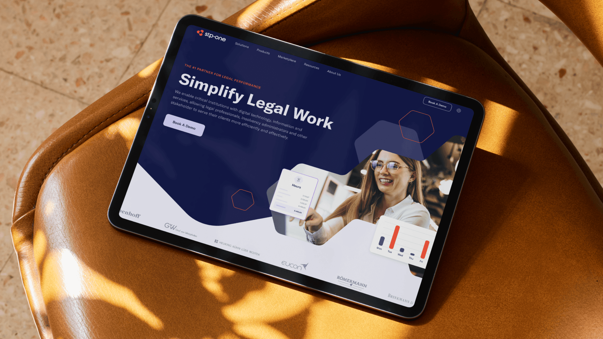
STP is a cutting-edge global tech company that is revolutionizing the legal landscape by offering an unparalleled digital hub, empowering lawyers and law firms with state-of-the-art tools, seamless connectivity, and unrivaled efficiency, ensuring they stay at the industry forefront. As lead on the brand team, I worked with Heyo to do a full rebrand including a new revamped website.
About the Logo
STP wanted to be known as the digital hub for legal tech in Europe. In addition, they had been a period of acquisition and wanted to create a new identity to unify their team and propel them forward. Using a series of three hexagons in a circular path, I created a visual representation of a digital hub. A fourth hexagon was used to subtract the center points creating arrowheads, referencing STP's growth-oriented mindset and pioneering spirit.


The GONs
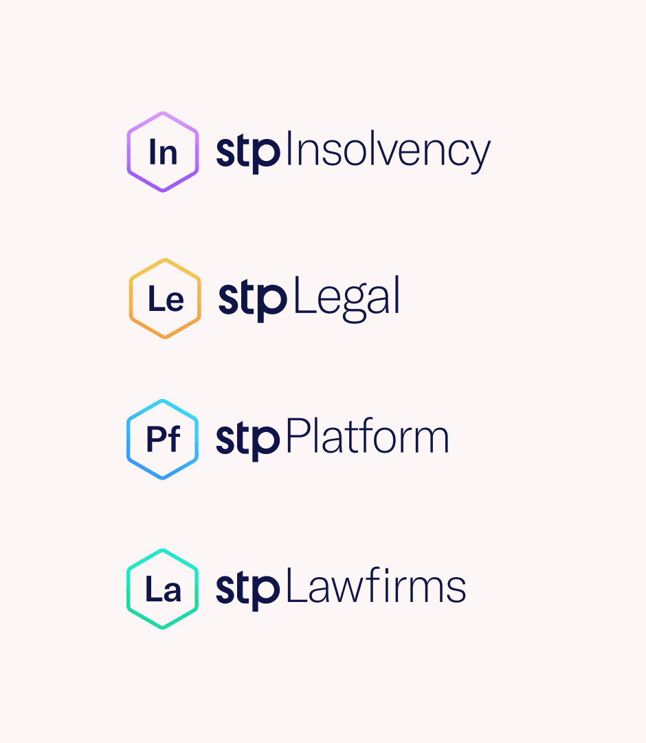
The hexagon shape became a key symbol for the visual identity of the brand, reinforcing the idea of digital hub and a unified platorm. By taking the shape and merging them together in different sequences, new shapes were formed that were used to anchor the brand. A library of these tethered polygons, affectionately dubbed "the Gons" by our wonderful clients, was made and used for various touch points of the brand.


©2025