
Remain at Home
Logo Design, Visual Identity
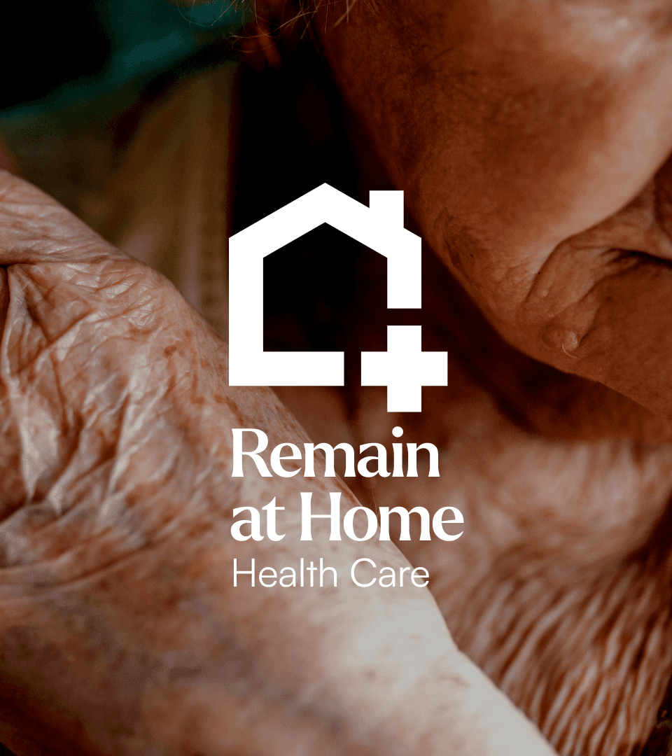
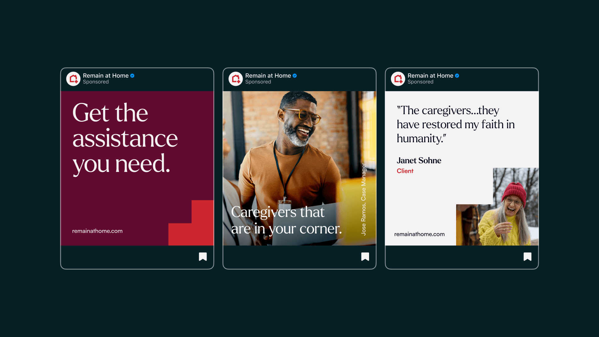
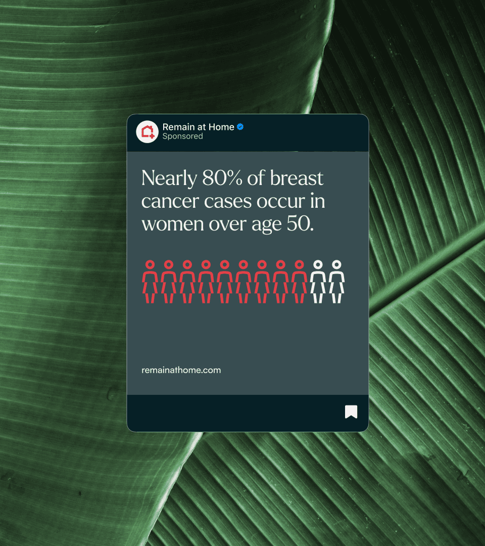
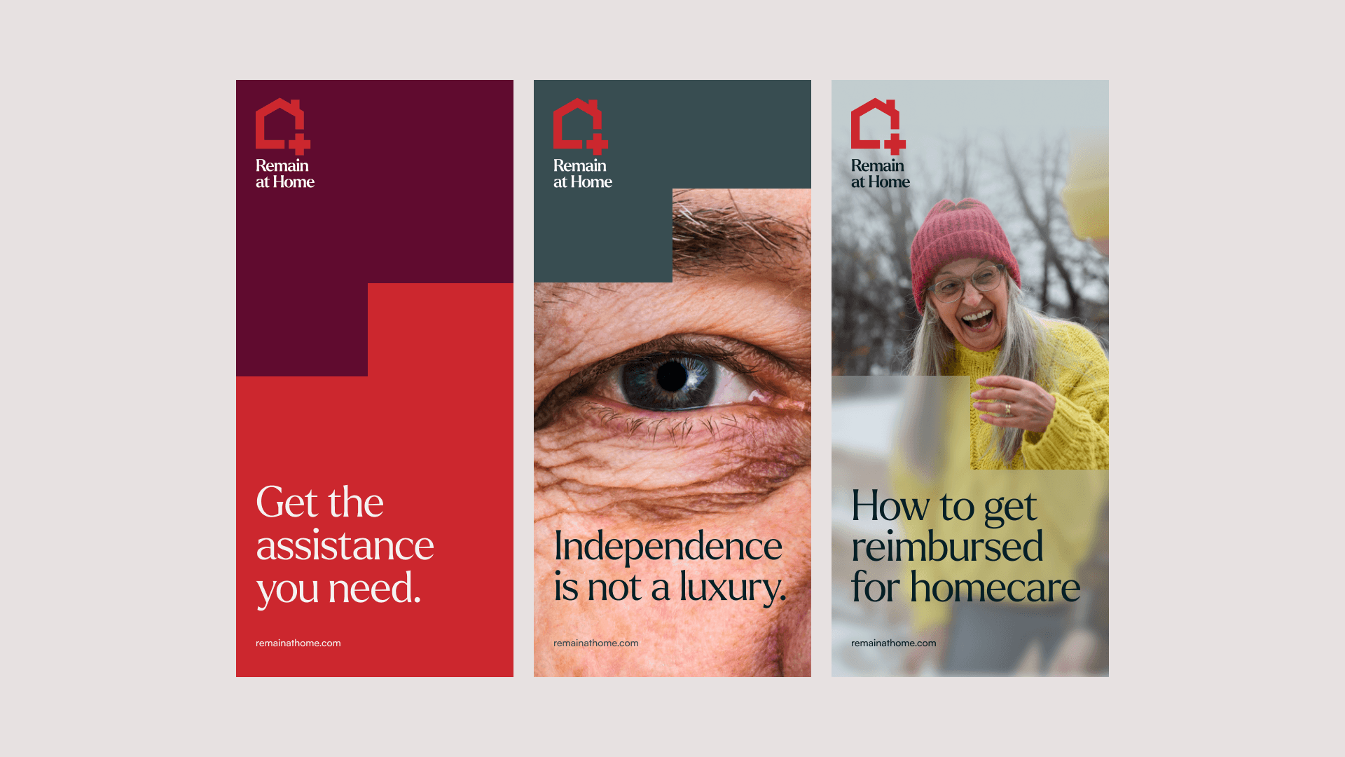
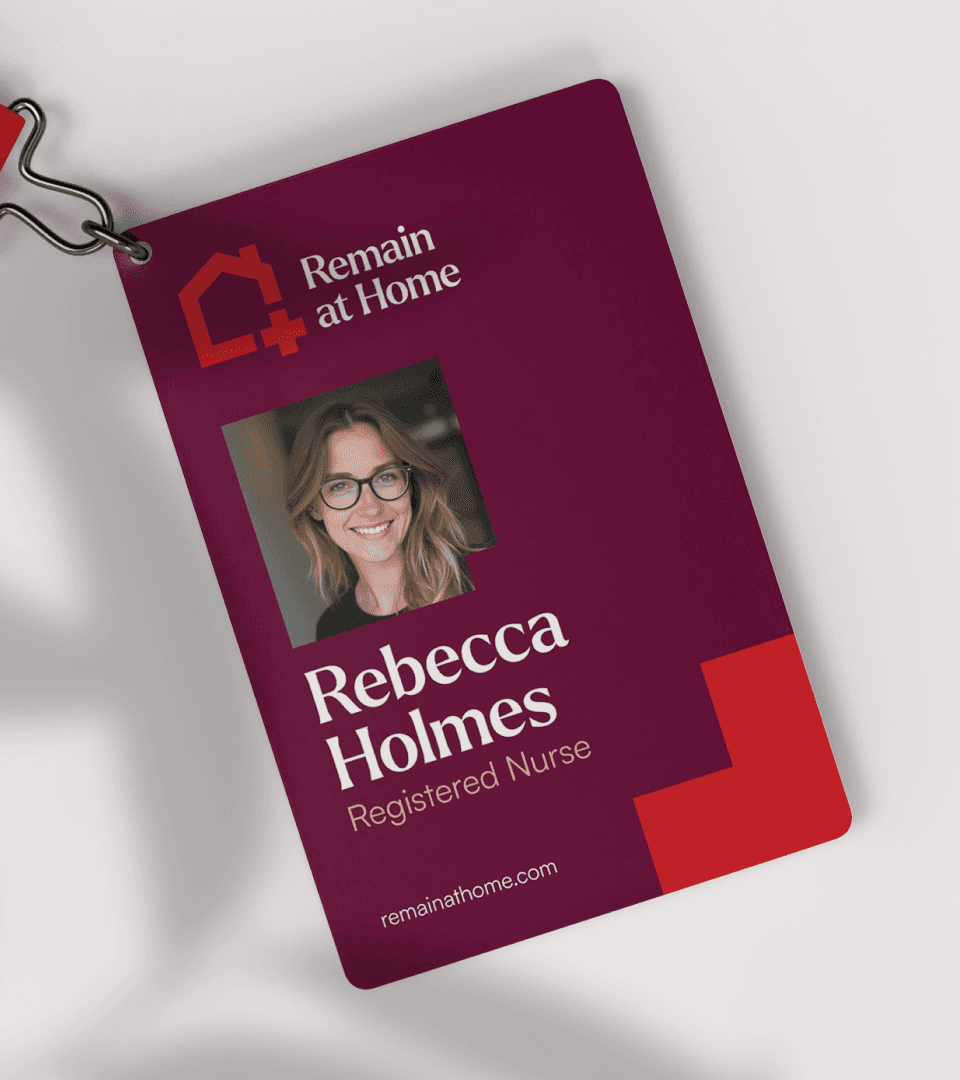
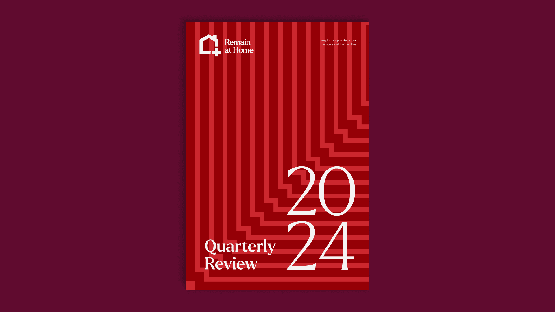
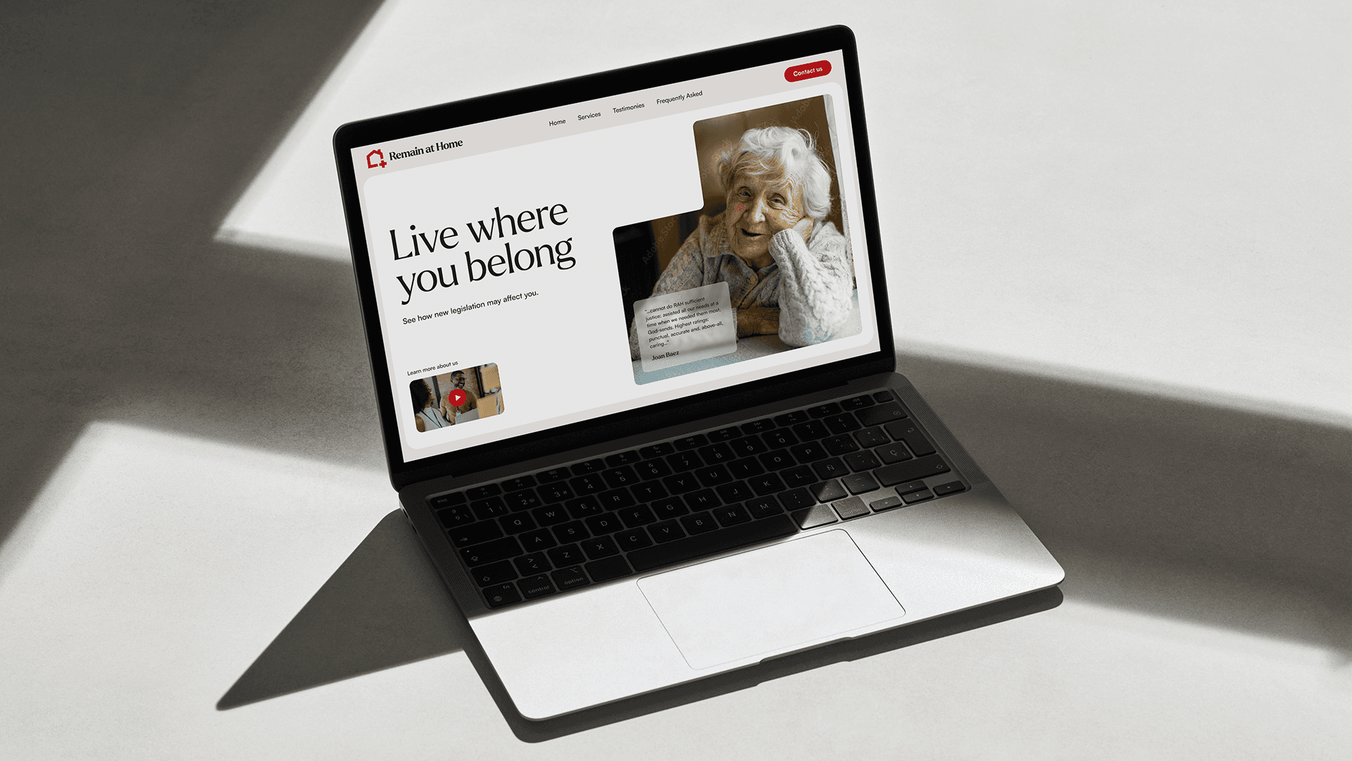
Remain at Home Health Care provides compassionate, 24/7 in-home nursing and support services to hold their promise of helping seniors live independently and with dignity. I partnered with them to create a new logo and visual identity to help them push forward their message.
About LOGO
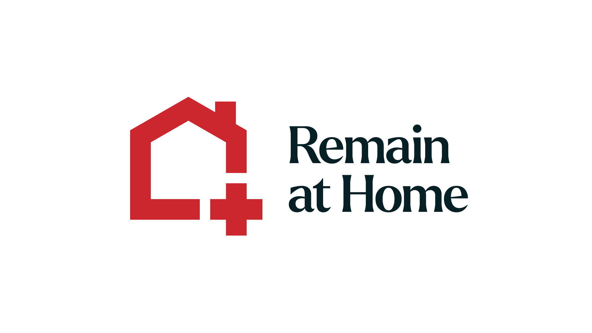
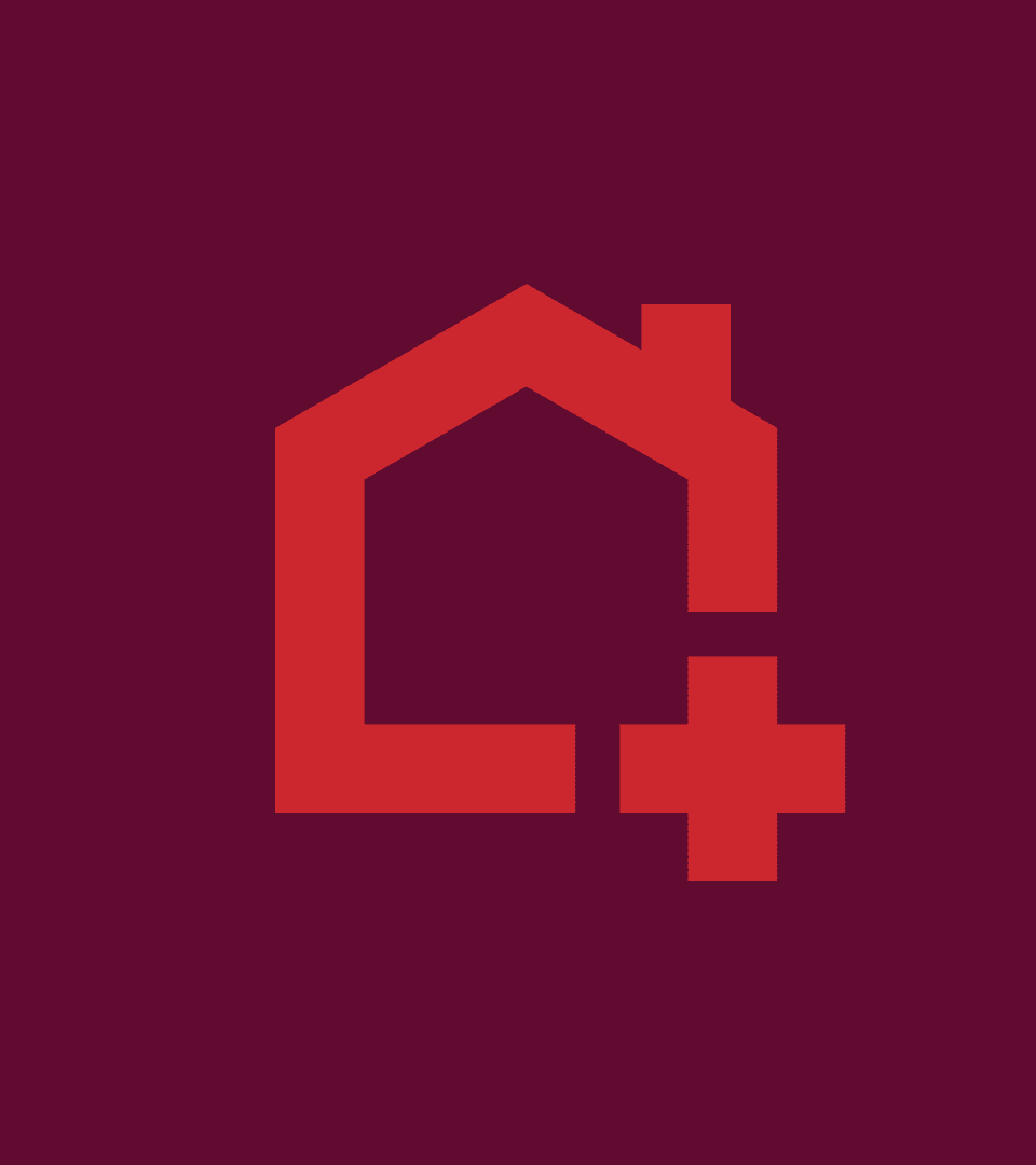
A home is powerful place. It houses memories, both good and bad. It can be a place of refuge and safety, of solitude and independence. This powerful symbol laid the foundation for Remain at Homes logo. Nestled perfectly into the cornerstone of the house mark is a medical cross, marrying health and home into one strong symbol.

“The sun at home warms better than the sun elsewhere.”
— Albanian Proverb


typography
With its warm, organic shapes and charming character, Larken proved to be a nice contrast to the structural feel of the house mark. In addition to being the type that Remain at Home's logo is set in, its softness and charm was chosen to frame Remain at Homes message.


Iconography
As part of the visual identity, a custom icon set was built. With a a few exceptions, one rule the set follows is to have an open portion, mimicking the openness of RaH's logo, both visually and thematically.


©2025