Roozy
Logo Design, Packaging, Visual Identity
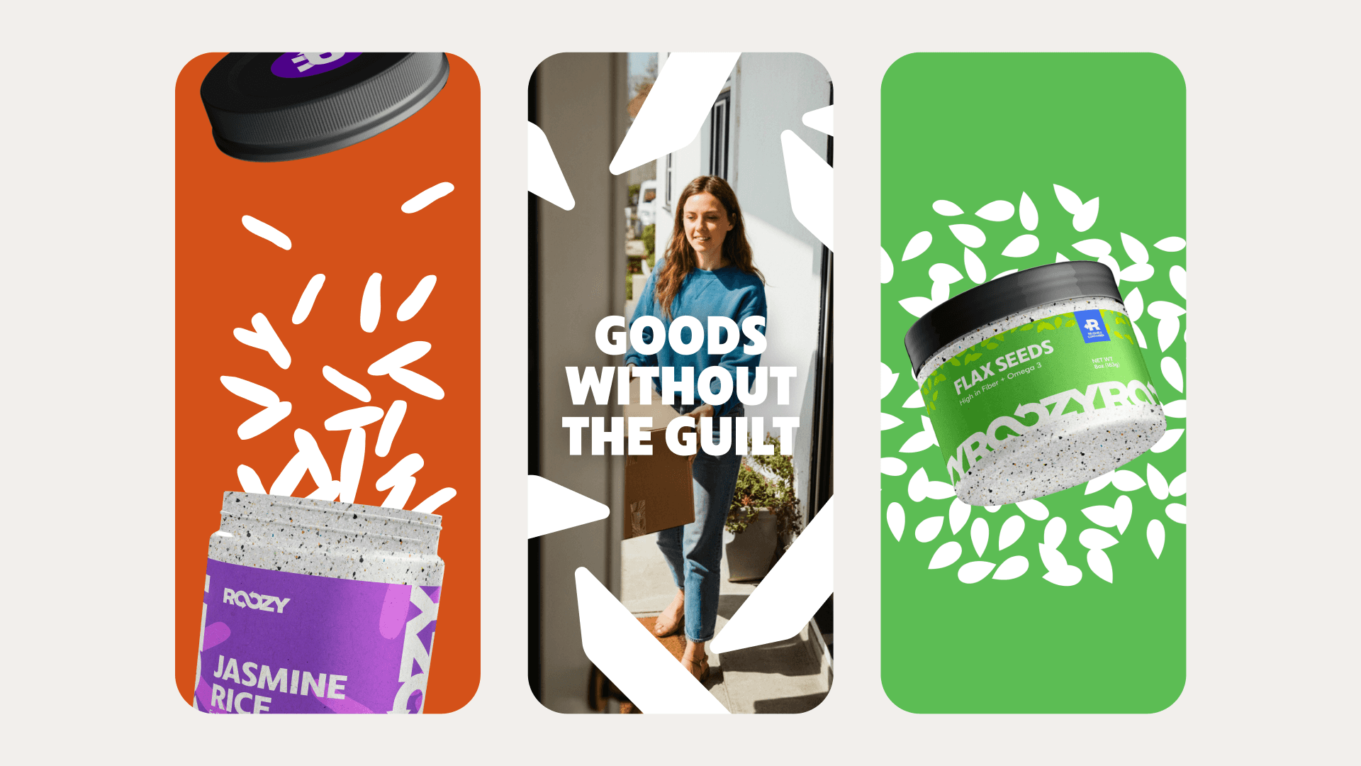
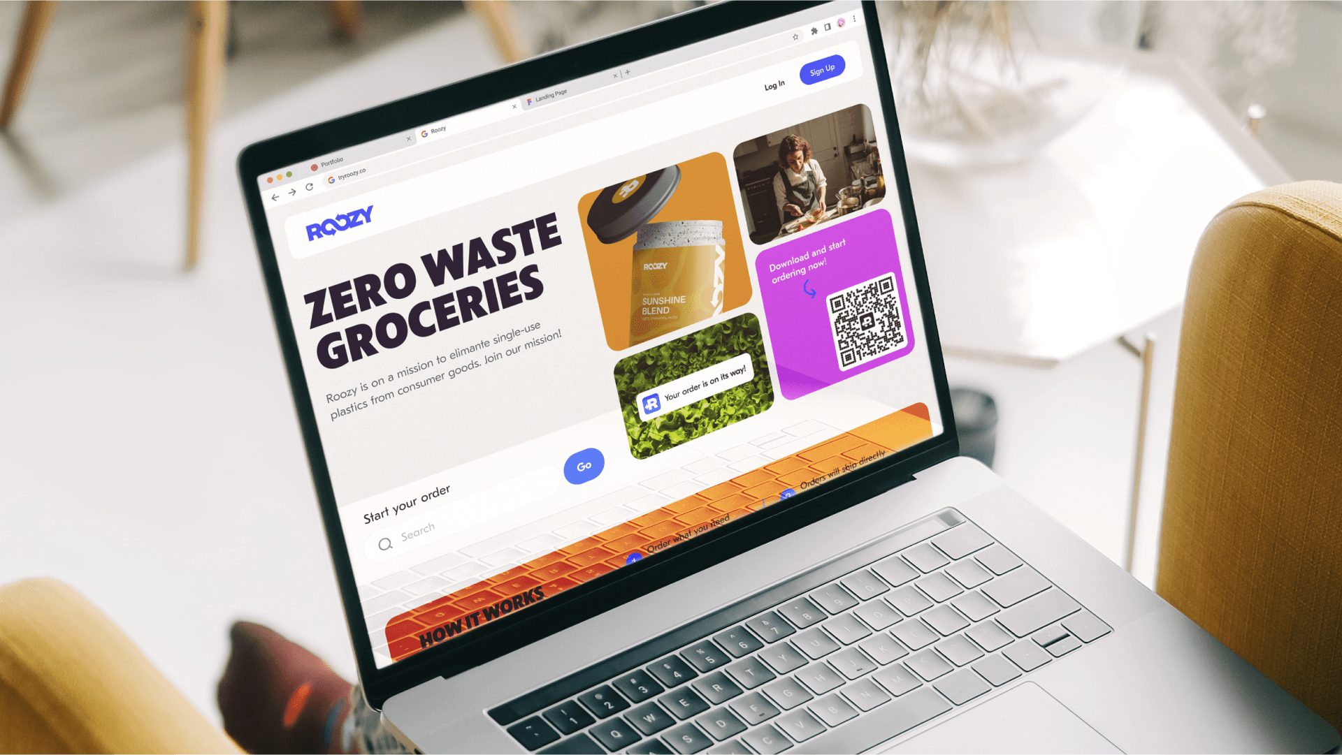
Roozy is a green tech start up set out to end single use plastics in consumer goods by allowing users to buy goods in reusable containers. They came to me to create a comprehensive visual identity for their platform that was bold, yet approachable.
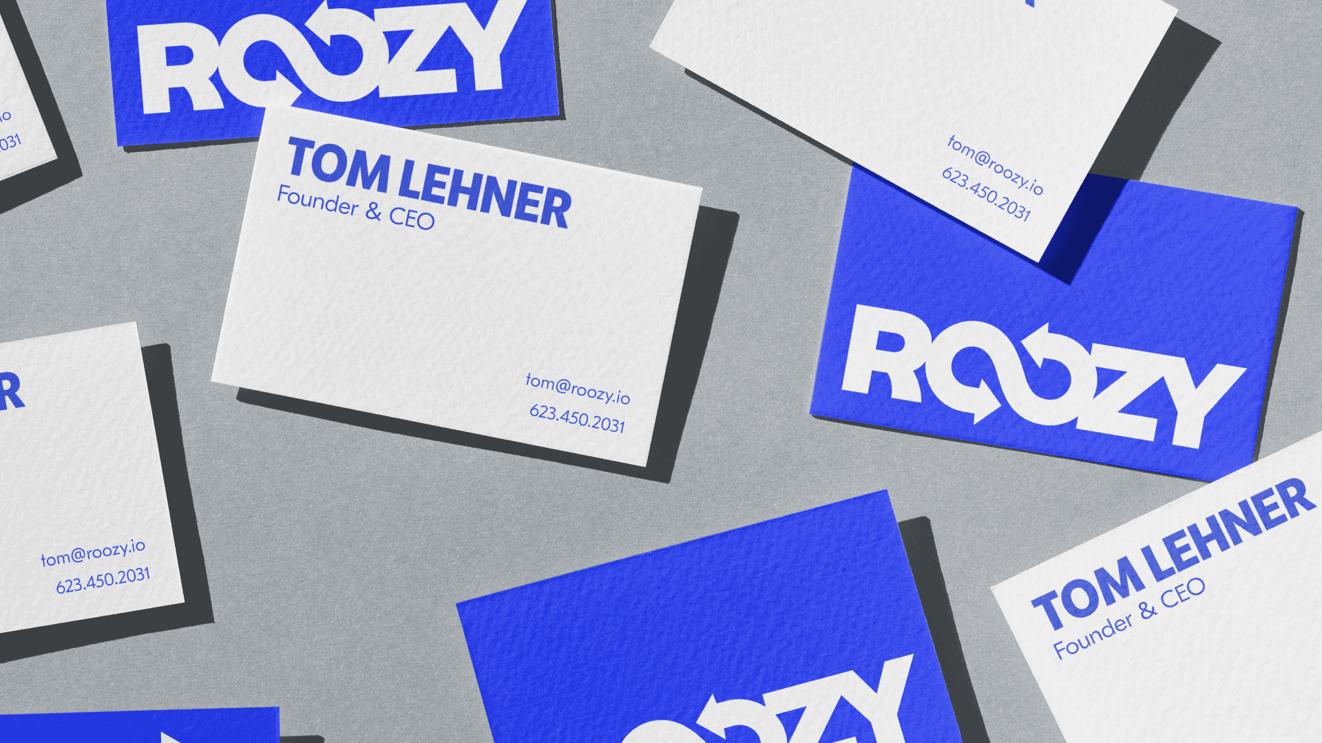
About the Logo
Roozy's mission is to close the consumer plastics to landfills loop. Their upcycled name, a play on the word 'reuse,' was made by smushing the inner vowels sounds together and pronouncing the silent 'e.' With such a short, playful moniker as Roozy, the strategy for the logo was to lean into the name and focus on a wordmarks. Right away the double 'o's' stood out. With the letters kerned tightly, the double 'o's' closely resembled an infinity symbol.
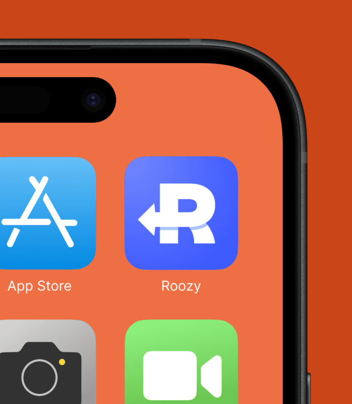

The mirrored loops of the infinity symbol form a closed loop, a perfect illustration of the Roozy ecosystem and apt emblem to represent the brand. In addition, I designed a condensed lettermark that references the double 'o' loops to pair with the wordmark.


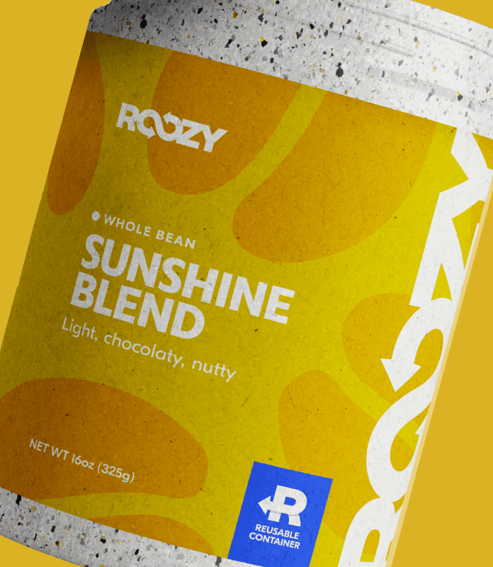
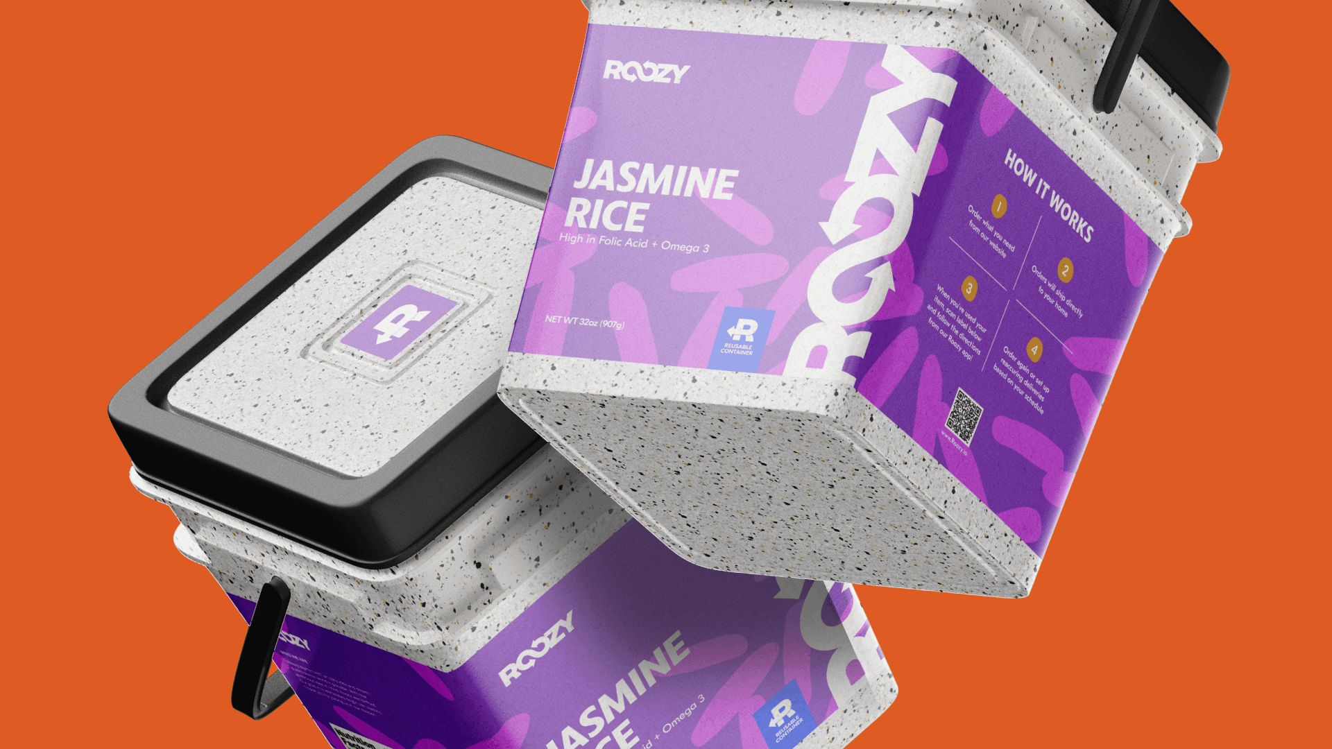
packaging
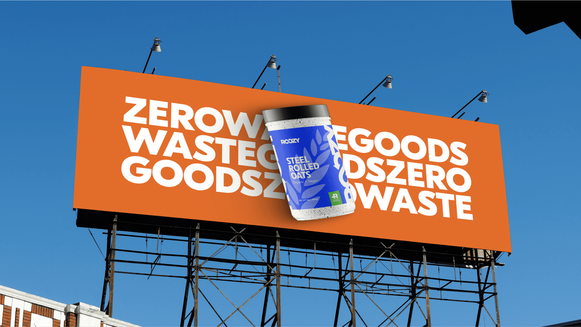
Packaging was a key feature of the visual identity. Each label is emblazoned with the logo stretching or repeating end to end to suggest an infinite loop.

Illustration
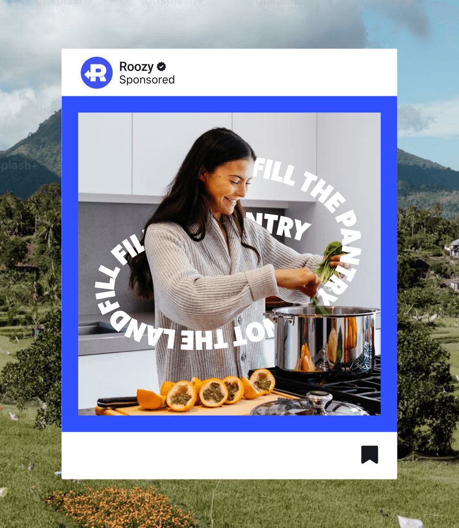
Illustration was another focal point of the visual identity. Simple silhouettes of the different product offerings that could be adjusted depending on the application. They could be soft and subtle like the textures on packaging or loud and prominent for when the brand needed to make a statement.


©2025