Aptvest
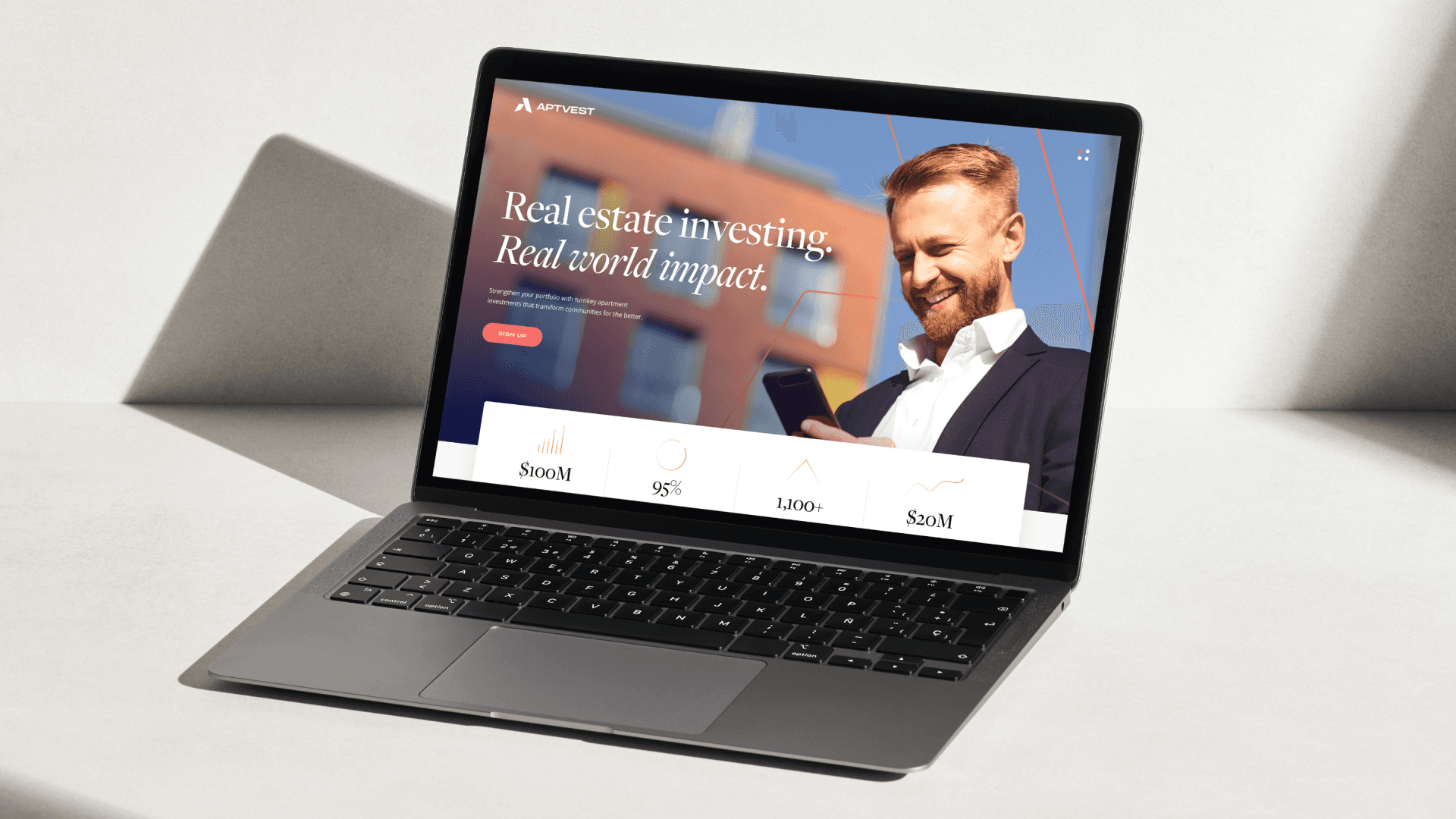
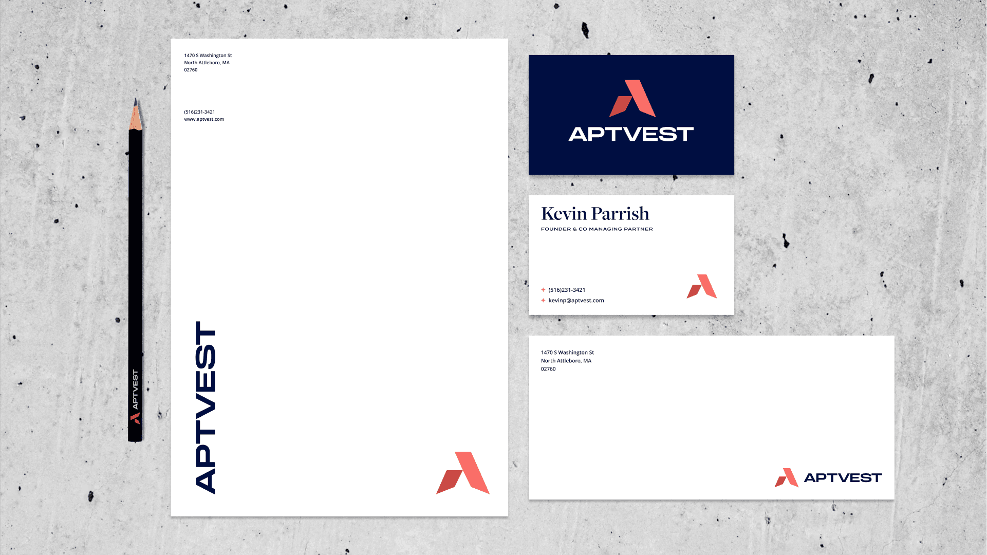
APTVEST had a problem. They saw themselves as leaders in the multi-family investment space but their visual communication did not reflect that vision. Working with Unfold/Heyo, I created a new visual identity to match their aspirations as thought leaders and industry movers.
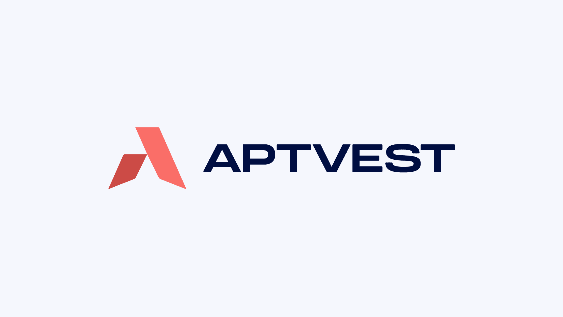


About Logo
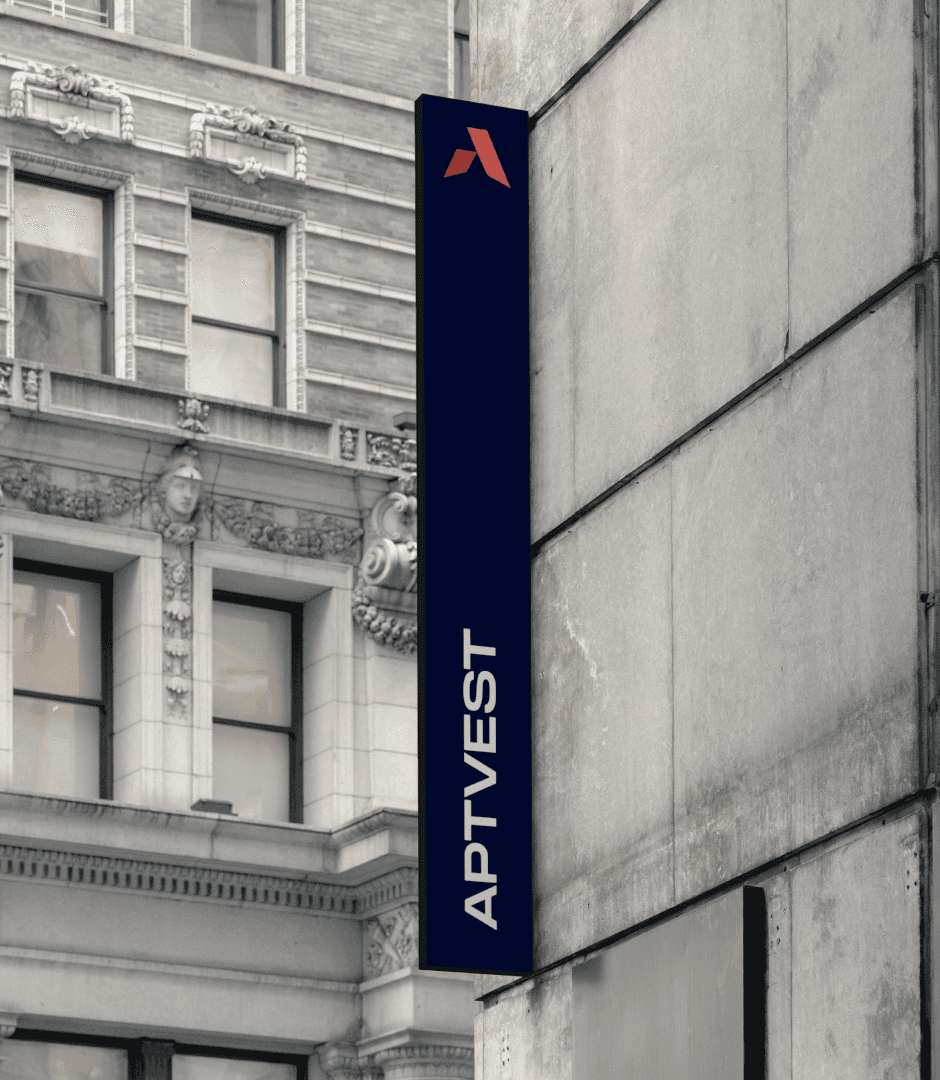
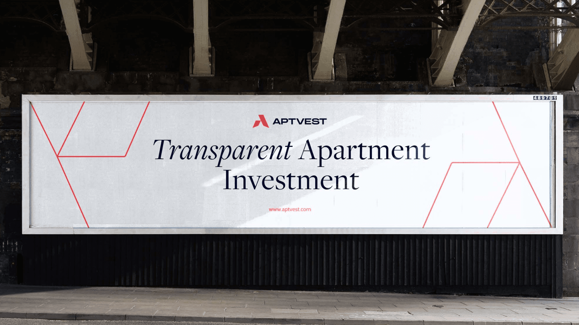
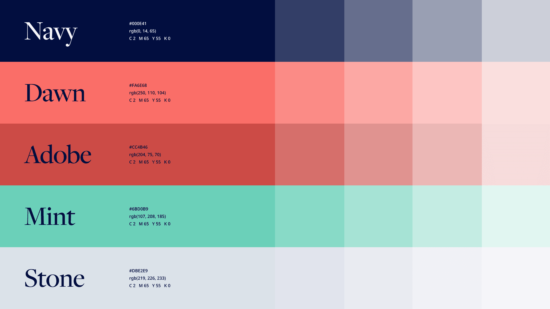
At the heart of the APTVEST logo is the star. It acts as a beacon and a guide. This is part of the APTVEST ethos. They are more than just investors. They are guides, leading their clients and partnering with them.


Typography
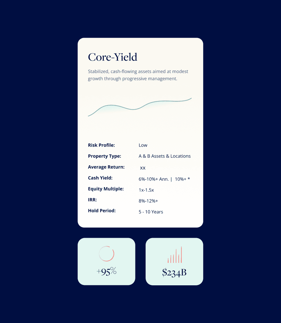
Typography played a huge role in APTVEST's visual identity. A type suite led by Freight provided a level of sophistication and gravitas that elevated the brand, providing a professional look not bogged down in stodginess.